
30 Days with Surface Pro: Day 4
In case you missed the memo–and all of the subsequent reviews and backlash since the new operating system launched–Windows 8 is a dramatic departure from Windows 7. Windows 8 is Microsoft’s first attempt to address the rise of mobile devices, and the hemorrhaging of the PC industry by developing a new OS designed to be a touch interface, and intended to blur the line between PC and mobile. That’s a pretty tall order.
The result is a bit of a Frankenstein approach. Rather than an interface that smoothly blends the new with the old, what we get with Windows 8 is a mobile, touch interface bolted onto what is essentially a Windows 7 desktop. It’s a duct tape and chewing gum approach that is at times awkward, and forces you to choose between the two.
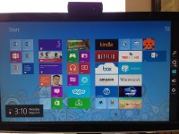
When I first boot the Surface Pro, I’m greeted with the new Windows 8 interface. It was called the Metro UI–and many still refer to it as such–but Microsoft opted to rebrand it as the Modern UI to avoid legal issues with a company that claims the rights to the Metro name. Whatever. No matter what you call it, the Windows 8 Start screen is pretty slick. It has large, colorful tiles–many of which are actively updated with live content such as current weather, breaking news, or upcoming calendar events. Working with the tiles on the Start screen–swiping and tapping and such–is a fairly natural and intuitive process for anyone who has ever used a smartphone or tablet.
The experience isn’t all wine and roses, though. I had to spend some time learning (and getting comfortable with) new gestures and conventions. For example, you have to swipe from the right side of the display to open the Charms bar, which enables you to Search or Share, access Devices or Settings, or tap Start to get back to the main Start screen from wherever you might be in the OS. Swiping from the top or bottom of the display opens an option to view All Apps, so you can see everything that’s installed rather than just the programs that have tiles pinned on the Start screen. Swiping from the left lets you “scroll” through the open apps.
The first thing to know…and get over, is that there is no Start button at the bottom left. Not even in desktop mode. The Windows key on the left side of the keyboard between Ctrl and Alt will take you back to the main Start screen, or you can swipe from the right of the display and tap the Windows Start logo. The lack of a Start button has generated some serious anti-Windows 8 backlash, but seriously it’s just not that big a deal.
One aspect that might be confusing for some is that the Start screen is the starting point for both Windows 8 apps and traditional Windows software. If you tap on People, or Music, or Calendar it will open the app in the Modern UI. But, if you install software like Microsoft Office, or Quicken it will add a tile to the Start screen, but tapping the tile will open up the application from within the desktop mode.
When you’re in desktop mode, it looks more or less like the desktop you’re used to in Windows 7 and older versions of the operating system. There’s a Task Bar at the bottom with the icons for programs that have been pinned there, or that are currently running. There’s a Systray at the lower right. There’s still no Start button, but if you move your mouse pointer to the bottom left corner and click it will take you back to the Start screen–so same functionality more or less, just without the button.
In desktop mode, you can use the Aero Snap feature to snap a window to the left or right half of the display, or maximize or minimize it by dragging it to the top or bottom. You can also use multiple, overlapping programs at one time. The Modern UI does allow for a split-screen, but it’s more of a 25% / 75% split of the display real estate. It works OK for leaving a messaging app or the Music app open in the small pane while you work in the larger one, but it doesn’t offer the same productivity potential as Aero Snap in desktop mode.
One issue I ran into was trying to use the calculator while working in the OneNote MX Windows 8 app. OneNote MX runs in the Modern UI, but the calculator opens in desktop mode. Using the split-screen, it’s possible to put the desktop in the small pane and run the calculator from there while using OneNote MX in the larger pane, but it’s a cumbersome, unintuitive process. It’s much easier to just use the traditional desktop version of OneNote that comes with Microsoft Office so you can just use the calculator right there on top of OneNote rather than switching back and forth or jumping through hoops.
Granted, that’s a limited use case, and one that may not impact most people. But, the point is that the new Windows 8 interface and the traditional Windows desktop interface–and their accompanying software–don’t always play well together, and navigating between the two can be an unnecessary burden. It seems like a capable OS, and I understand Microsoft’s dilemma with trying to transition hundreds of millions of users to a new way of doing things, but this first iteration is a bit awkward. I think Microsoft will have a much smoother OS by Windows 10.
Comments
7 responses to “Surface Pro, Day 4: Navigating Windows 8”
[…] starters, the split personality of Windows 8 is a huge issue when it comes to the Web browser. Before I even begin to look at alternate […]
[…] Surface Pro, Day 4: Navigating Windows 8 […]
[…] side of the screen (or swipe from the right if I was using the touch display instead of a mouse) to open the Charms bar, and tapped on Settings. The settings for customizing the Start screen aren’t one of the few […]
[…] Day 4: Navigating Windows 8 Day 6: Good, bad, and ugly of Windows 8 Store […]
[…] Day 2: Unboxing the tablet Day 4: Navigating Windows 8 […]
[…] Surface Pro Surface Pro, Day 2: Unboxing the Tablet Surface Pro, day 3: Logging in to Windows 8 Surface Pro, Day 4: Navigating Windows 8 Surface Pro, Day 5: Tweaking the display Surface Pro, Day 6: Good, bad, and ugly of Windows 8 Store […]
[…] 8 with a mouse during the first 13 days of the 30 Days with Surface Pro series. It was a bit of a learning curve initially, but it only took a few minutes to get used to using the corner hotspots to and navigate Windows 8 […]